For Non-Coders & Coders: Build and Vet Your Application Ideas With AI-Generated Wireframes Before Using AI Vibe Coding to Build the Rest
Before you write a single line of application code, you can know whether your idea works. AI has made interactive wireframing — the practice of building a functional, testable representation of an application’s user interface before committing to its full construction — fast enough, cheap enough, and accessible enough that skipping it is no longer a reasonable choice. This article teaches a broad audience — from non-technical readers like business analysts and liberal arts educators & students to technical readers like architects, software developers, and engineers — how to use AI to build interactive wireframes that vet application ideas before investing in Vibe Coding’s full backend and infrastructure, all using a real example: "Color Control App." The payoff is significant: ideas that fail are caught early, when fixing them costs minutes rather than weeks. Ideas that succeed arrive at the build phase with a validated specification, a tested UX, and a far clearer set of instructions for the AI tools that will build the rest.
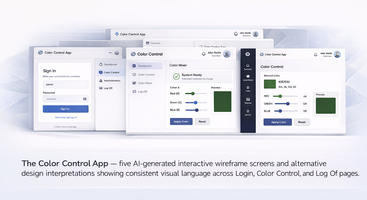
The Color Control App — five AI-generated interactive wireframe screens showing consistent visual language across Login, Color Control, Color Mixer, Administrator Dashboard, and Log Off pages.
Author: Frank Guerino
The Color Control App: Our Running Example
The Color Control App referenced throughout this article is a real, working example used to walk the reader through every concept as the article evolves. It consists of five AI-generated interactive wireframe screens demonstrating consistent visual language across Login, Color Control, Color Mixer, Administrator Dashboard, and Log Off pages. This article explains how AI is used to generate those screens, how expected behaviors are specified for each page, and how user flows between pages — the User Experience (UX) — are defined and enforced through natural language specification. A complete copy of the full specification is included as an appendix at the end of this article.
The Problem with Jumping Straight to Building
There is a natural impulse, when an application idea takes hold, to start building immediately. With modern AI Vibe Coding tools, that impulse is easier to act on than ever before. Describe what you want, iterate on the output, and within hours or days you have a working application — frontend, backend, database, deployment. The speed is real and the results are often impressive.
The problem surfaces later. You show the application to the people who will use it, and they do not interact with it the way you imagined. The navigation feels wrong. A key workflow is missing a step. A screen that seemed clear in your head is confusing in practice. A feature you did not think to include turns out to be essential. These are not implementation problems — they are idea problems. And they are the most expensive kind to fix once the application is built, because fixing them means revisiting not just the frontend but the backend logic, the data model, and potentially the architectural decisions that were made to support the original misunderstanding.
The solution is not new: validate the idea before you build the full application. What AI has changed is that this validation step — traditionally expensive, slow, and technically demanding — is now accessible to anyone who can describe what they want in plain language.
What AI Wireframing Actually Is
An AI-generated wireframe is not a static diagram or a low-fidelity sketch. It is a fully interactive, functional application — running live in a web browser — that implements the user interface as described in a natural language specification. You can click buttons. You can fill in forms. You can navigate between pages. You can see what the application actually feels like to use. The only thing missing is the real backend: no database, no authentication server, no integration with other systems, no production infrastructure.
What makes AI wireframing fast and cost-effective is precisely this constraint: the deliberate decision to leave the backend out. A 100%-in-browser application has no deployment dependencies, no infrastructure costs, no integration complexity, and no security attack surface. It can be generated in minutes, iterated on in seconds, and thrown away without consequence. It is a thinking tool, not a deliverable.
AI wireframing can be performed in two environments. The first is the browser itself — using a conversational AI tool in a chat interface, loading the natural language specification, and receiving a runnable application in return. No setup, no installation, no technical background required. The second is a dedicated Vibe Coding platform such as OpenAI Codex or Claude Code, which produces structurally cleaner, more internally consistent code and tends to drift less between generation sessions. Neither environment is required — start in the browser for speed, move to a Vibe Coding environment when consistency and build-readiness matter.
Who This Is For — and Why Each Audience Benefits
The barrier to entry for AI wireframing is not technical knowledge — it is the ability to describe what you want clearly and completely.
Business Analysts. Requirements gathering, process decomposition, and the translation of business needs into functional specifications are the core of the BA role — and precisely the skills that produce effective wireframe specifications. The wireframe becomes a powerful stakeholder validation tool: instead of reviewing a requirements document, stakeholders interact with the proposed application directly.
Enterprise and Business Architects. Architects can surface UX-driven architectural requirements — real-time data needs, role-based access complexity, data volume — before those requirements become expensive surprises.
Solutions Architects and Developers. The wireframe sharpens the specification to a level of precision that drives AI-assisted code generation with significantly less ambiguity, fewer revisions, and lower risk of rollback.
Students and Educators. Students explore application ideas and see them running without learning backend technologies or managing deployment infrastructure. The iteration speed makes it an effective medium for classroom exploration of design decisions.
Non-Technical Business Users and Domain Experts. The subject matter expert who knows most deeply what an application needs to do can now build a working representation of their idea without writing code, without hiring a developer, and without waiting for IT.
The Full Case for Wireframing First
You find out if your idea works before it is too late to change it cheaply. In a wireframe, UX discoveries cost minutes. In a fully-built application, they cost days or weeks.
You can vet your ideas with others before committing to them. When stakeholders can click through a working prototype, their feedback becomes specific and actionable in a way that written review rarely achieves.
The wireframing process sharpens the specification. By the time the wireframe is working correctly, the design is essentially done. The Vibe Coding that follows is faster and more accurate.
The wireframe becomes the foundation for more accurate backend generation. AI tools given a wireframe-derived specification produce more reliable code and are less likely to make assumptions that diverge from the intended design.
It aligns with how good design and development actually works. The rapid iteration cycle directly implements Design Thinking’s creativity loops, Outcome-Based Design, Goal-Based Design, Test-Driven Development, and the core principle of Agile. AI has not invented this approach; it has made it dramatically faster and cheaper.
This Isn’t New Thinking — AI Just Makes It Faster
AI wireframing is an acceleration of design and development practices that professionals have trusted for decades.
Design Thinking. The Prototype and Test phases of Design Thinking map almost exactly onto AI wireframing. AI removes the time and cost barriers that have historically limited how many prototype-test iterations organizations could afford to run.
Outcome-Based Design (OBD). Writing a wireframe specification well requires beginning with outcomes — what the user needs to accomplish — before specifying any interface element. The acceptance criteria are outcome verification criteria: they define when the outcome has been achieved correctly.
Goal-Based Design (GBD). The Color Control App demonstrates GBD clearly. A general user’s goal is to personalize the application’s appearance. An administrator’s goal is to maintain governed access. These different goals produce different page designs, navigation options, and access constraints.
Test-Driven Development (TDD). The acceptance criteria in a wireframe specification are the tests. The AI-generated wireframe is the implementation. When the wireframe fails a criterion, the specification is refined and the wireframe regenerated — this is the TDD red-green-refactor cycle running on a UX prototype.
How to Write a Good Wireframe Specification
The quality of an AI-generated wireframe is almost entirely determined by the quality of the specification that drives it. Every ambiguity is an invitation for the AI to make a choice that may not match what you intended. A good wireframe specification is organized into four layers. Practitioners of Design Thinking will recognize this as operationalizing the Prototype phase. Practitioners of OBD and GBD will notice that each layer begins with purpose. Practitioners of TDD will find the acceptance criteria in Layer 3 most familiar.
Layer 1: Ground Rules and Constraints
Before specifying any pages, establish the non-negotiable constraints that every page and component must respect. These prevent the AI from making conflicting decisions across the application.
From the Color Control App Spec — Ground Rules: "Since this is a prototype that is only for demonstration purposes, the app must run 100% in the browser, with no dependencies on any external technology or infrastructure." And: "Whenever and wherever there is a 'button' on any page, it must default to a color of 'very light grey' with black text. If a user hovers over such a button, the background color will change to black and it will display an inverted text color."
Ground rules go beyond technology constraints into precise interaction behavior. A rule like the button hover rule is a consistency guarantee that removes discretion from the AI across every button on every page.
Layer 2: Cross-Page Requirements
Describe elements and behaviors that appear on every page, or every page with named exceptions. This layer establishes the consistent visual and behavioral framework within which each individual page operates.
One of the most important cross-page requirements in the Color Control App is the Single Source of Page Titles rule — instructive because it comes with its own acceptance criteria, three named scenarios that tell the AI exactly what to verify:
From the Color Control App Spec — Single Source of Page Titles: "Exactly one page title is shown at a time. When the Top Bar is present, the Top Bar is the sole owner of the page title; individual pages must not render their own titles in the page body. When the Top Bar is not present (Login and Log Off), the page itself must render its title at the top of the page body. Acceptance criteria: On Color Control and Administrator Dashboard, only the Top Bar shows the title. On Login and Log Off, the page body shows the title. Navigating between pages never results in two titles appearing at once."
Notice the structure: a rule, its exceptions, and three named scenarios each with a defined expected outcome. This is TDD applied to a cross-page layout requirement. A second cross-page component worth studying is the navigation drop-down, which requires five sub-rules because each addresses a different dimension of its behavior:
From the Color Control App Spec — Navigation Drop-Down Selector: "The navigation drop-down alone requires five distinct sub-rules — each addressing a different failure mode AI would otherwise encounter. The full set is in Appendix A."
From the Color Control App Spec — Left Side Navigation Pane: "With the exception of the Login Page, every web page must have a vertical left side navigation pane that alphabetically lists buttons which represent links to all other pages in the application. The top must have the title 'Site Navigation' in bold. The bottom must always have a 'Log Off' button that routes the user to the Log Off Page. The Left Side Navigation Pane must not appear on the 'Login Page' or the 'Log Off Page'."
Layer 3: Page-by-Page Specifications
The third layer is where the majority of the specification lives: detailed requirements, constraints, and acceptance criteria for each individual page. The five wireframe screens below illustrate what the Color Control App looks like when the specification has been applied — note the consistent header, left-side navigation pane, and footer across every page that has them.
Login Page — The entry point of the application. No navigation pane, no Log Off button. The page renders its own title, shows the User ID input field and Log In button, and lists all allowable users with their roles.
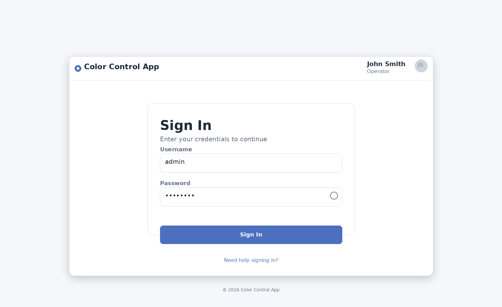
Figure 1: Login Page wireframe — simplified entry point with User ID field, allowable users list, and inline error message placement.
The Login Page is a clean example of Outcome-Based Design: it specifies exactly two possible outcomes of attempting to log in, along with the verbatim message text and display color for the failure case:
From the Color Control App Spec — Login Page Outcomes: "After the user enters a user ID string and selects the Log In button, one of two outcomes are possible. Outcome 1: If a user tries to log into the application with a non-valid user ID, the user must see the message 'Invalid user ID. Please enter a valid user ID and try again.' This message must be displayed in red font color. Outcome 2: If the user enters a valid user ID, the user must be routed to and see the Color Control Page."
Specifying error messages verbatim prevents the AI from inventing its own language. Specifying exact display position prevents it from placing messages where they might be missed. The spec also defines cursor behavior, field length constraints, and display rules for the allowable users list — see Appendix A for the full detail.
Color Control Page — The core page after login. The three-column ROYGBIV layout with radio buttons, sliders, and color preview rectangles. Red is shown as the selected color at full intensity.
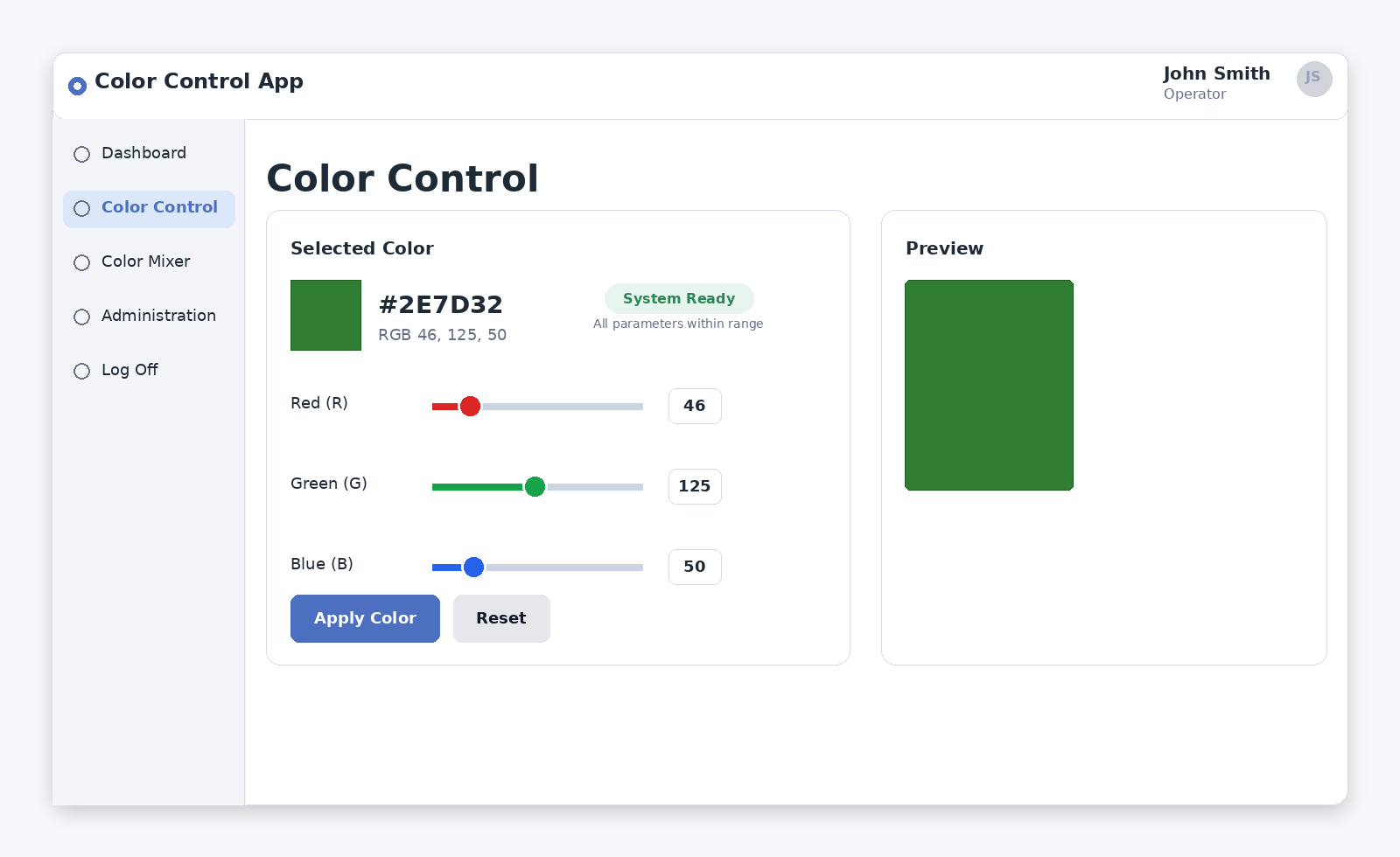
Figure 2: Color Control Page wireframe — three-column ROYGBIV layout with radio buttons, intensity sliders, color preview rectangles, and Apply button.
The Color Control Page defines what “aligned” means before describing any layout element — a direct application of the precision principle. The acceptance criteria for the layout are stated as five specific conditions, each testable:
The spec defines five testable acceptance criteria for layout alignment — covering column structure, slider positioning, caption placement, and wrapping behavior — and a further set for the Apply button and color-matching behavior. See Appendix A for the complete detail.
From the Color Control App Spec — Color Control Acceptance Criteria: "When a specific color value and intensity are selected and applied by the user, ensure that the border is the same color value and intensity that is in the active rectangle. For example: if the user selects and applies the color value '#00a000', both the active rectangle and the border must match and be set to the color value #00a000."
Color Mixer Page — The interactive mixing page. RGB/Subtractive mode toggle, three color swatches with ratio sliders, real-time mixed result display.
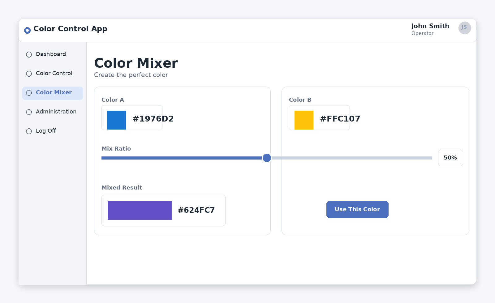
Figure 3: Color Mixer Page wireframe — RGB/Subtractive mode toggle, three color inputs with ratio sliders, and real-time mixed result display.
Administrator Dashboard — The role-restricted management page. Users table with checkboxes, Add New User field, unsaved-changes warning, and Apply button.
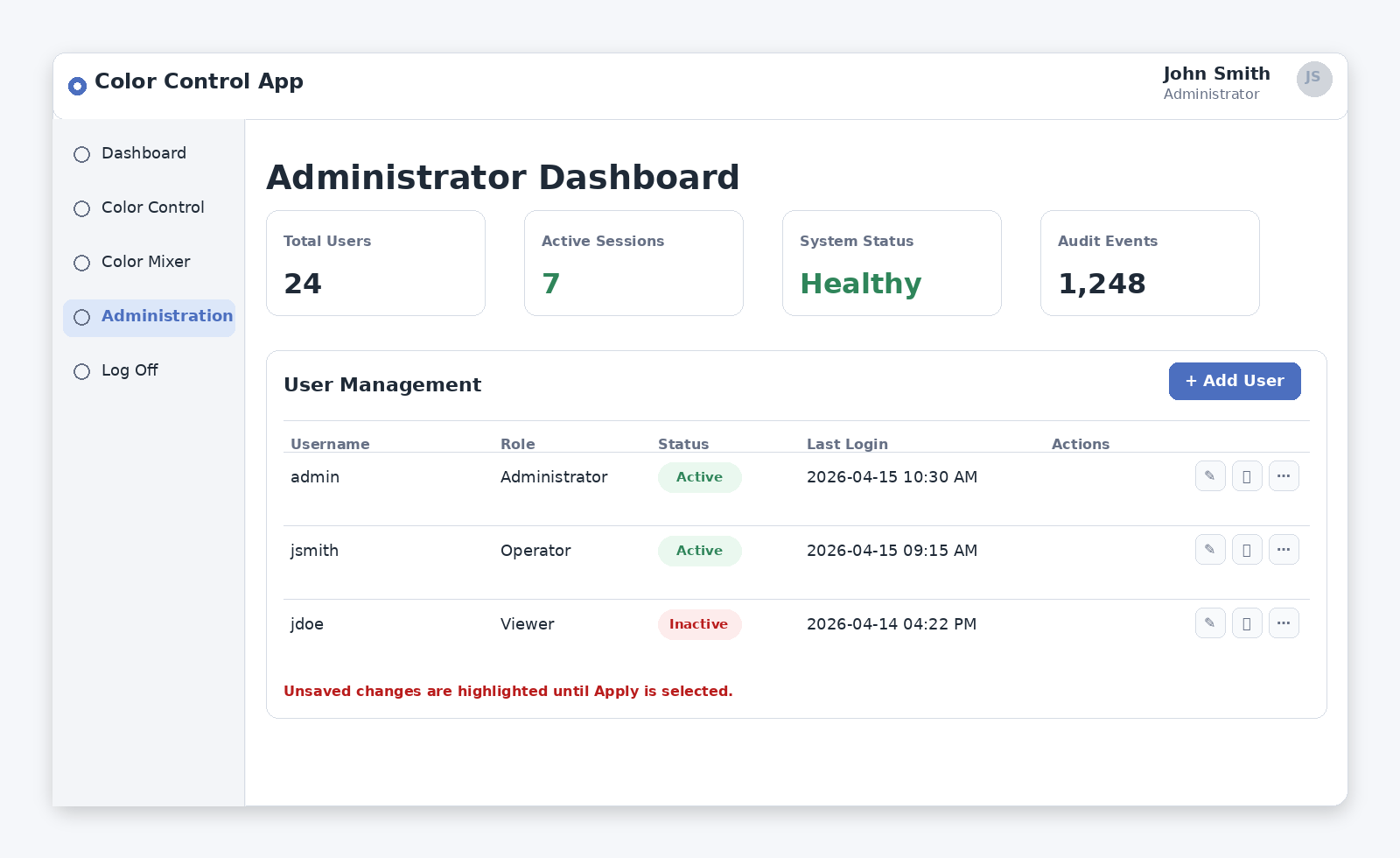
Figure 4: Administrator Dashboard wireframe — users table with role checkboxes, Add New User field, unsaved-changes warning, and Apply button.
The Administrator Dashboard demonstrates defensive design in a specification: rules that prevent the system from entering an invalid state. The most important is the at-least-one-administrator guardrail, which specifies both the enforced behavior and the exact verbatim error message text:
From the Color Control App Spec — Administrator Dashboard Guardrail: "If an administrator tries to deselect all checkboxes, he or she will not be allowed to do so and will receive a message in red text that states: 'There MUST always be at least one administrator for this application.' This message must be displayed just to the left of and at the same level as the Apply button."
Notice that both the message text and its exact screen position are specified. The same pattern applies to the unsaved-changes warning and the Apply success message — every user-facing message in the spec has its text and position defined, leaving nothing to interpretation.
Log Off Page — The confirmation screen. Confirmation question with Yes/No buttons.
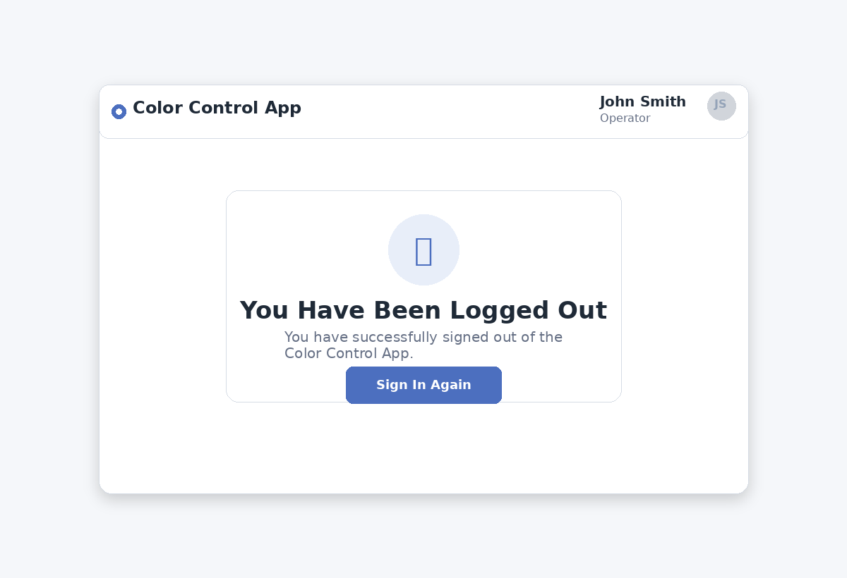
Figure 5: Log Off Page wireframe — confirmation prompt with Yes/No buttons and clear routing behavior for each choice.
Even the simplest page warrants explicit outcome statements for every button — the full routing rules for both Yes and No are in Appendix A.
Layer 4: Execution Rules
The final layer is a short, direct instruction to build and run the application. All decisions have already been made above. The Color Control App’s execution rules are deliberately minimal: “At this point, build and run this application ensuring that it is '100% in the browser.' Tell me when the application is built and ready to test.” The brevity is intentional — the execution instruction is the trigger, not the place to introduce new constraints.
The Precision Principle: Tighter Specs, Less Drift
The original Color Control App specification notes: “The narrative form in this document intentionally does not represent a ’tight' specification. This means that every time you load it into AI, you have a chance that it builds and displays elements of the UI a little differently than other times you did so. The tighter (i.e., more detailed) your specifications, the lower the probability that AI will drift and take liberties.”
This generation-to-generation variability is predictable and observable. Load the same underspecified prompt twice and you may receive two wireframes that differ meaningfully in layout, component placement, interaction behavior, or visual styling. Neither is wrong — both are valid interpretations of an ambiguous specification. The variation is a signal: every element that changes between generations is an element that has not yet been fully specified.
There is a related phenomenon worth understanding: AI tools are inherently probabilistic and can produce slightly different outputs from the same specification across different sessions — even when the specification is reasonably tight. This is normal behavior, not a malfunction. If a variation is trivial, ignore it. If it is meaningful, treat it as a specification gap and add a rule that removes the AI’s discretion.
The choice of environment also affects drift. Vibe Coding platforms such as Codex and Claude Code tend to produce more consistent outputs for a given specification. As your wireframe matures, moving to a Vibe Coding environment is a natural step that reduces the specification work needed to achieve consistent output.
Write the specification in two passes. First: write what you know and generate. Second: add rules for every element that did not behave as intended, every interaction that felt wrong, and every element that rendered differently from the previous generation. Each revision is a permanent improvement.
The Rinse-and-Repeat Iteration Loop
The working rhythm of AI wireframing is a tight loop: specify, generate, test, refine, repeat. This is the Design Thinking prototype-test cycle, the TDD red-green-refactor cycle, and the Agile sprint model all operating on the same artifact at the same time.
Specify. Write or revise the specification. First iteration: the initial draft. Subsequent iterations: targeted additions based on what the previous test revealed.
Generate. Load the specification into the AI tool and let it build. Let the full build complete before testing.
Test. Interact with the generated wireframe as a real user. In the Color Control App, testing includes: verifying the color frame persists across page navigation; confirming the administrator dashboard enforces the one-administrator minimum with the correct verbatim error message; verifying color intensity in the active rectangle exactly matches the applied frame; checking that the correct red error message appears on the Login Page for an invalid user ID; confirming the Log Off No button returns the user to the correct prior page; and confirming that non-administrators cannot see the Administrator Dashboard in the navigation drop-down.
Refine. Update the specification based on test results. Add acceptance criteria for ambiguous behaviors — define what "passing" looks like before regenerating. Every refinement is permanent.
The loop terminates when the wireframe behaves as intended across the full set of user interactions you need to validate.
Exploring Design Alternatives with AI
AI also makes it straightforward to explore and compare visual design options. Once the functional specification is stable, the same specification can be presented to AI with instructions to produce multiple valid visual interpretations — different look-and-feel treatments that all satisfy the same functional requirements.
The comparison below shows two such interpretations of the Color Control App specification: Option A — an Enterprise Baseline — and Option B — a Refined Modern Variant. Both satisfy the same functional requirements and implement the same navigation structure, role-based access rules, ROYGBIV color control layout, and administrator dashboard behavior. The difference is not correctness — it is interpretation, presentation, and the user experience choices that follow from different visual design philosophies.
Don’t be afraid to ask AI for advice on how to write rules, constraints, requirements, specifications, and acceptance criteria for your application’s features. Doing so will save you a great deal of time and allows you to easily explore different options.
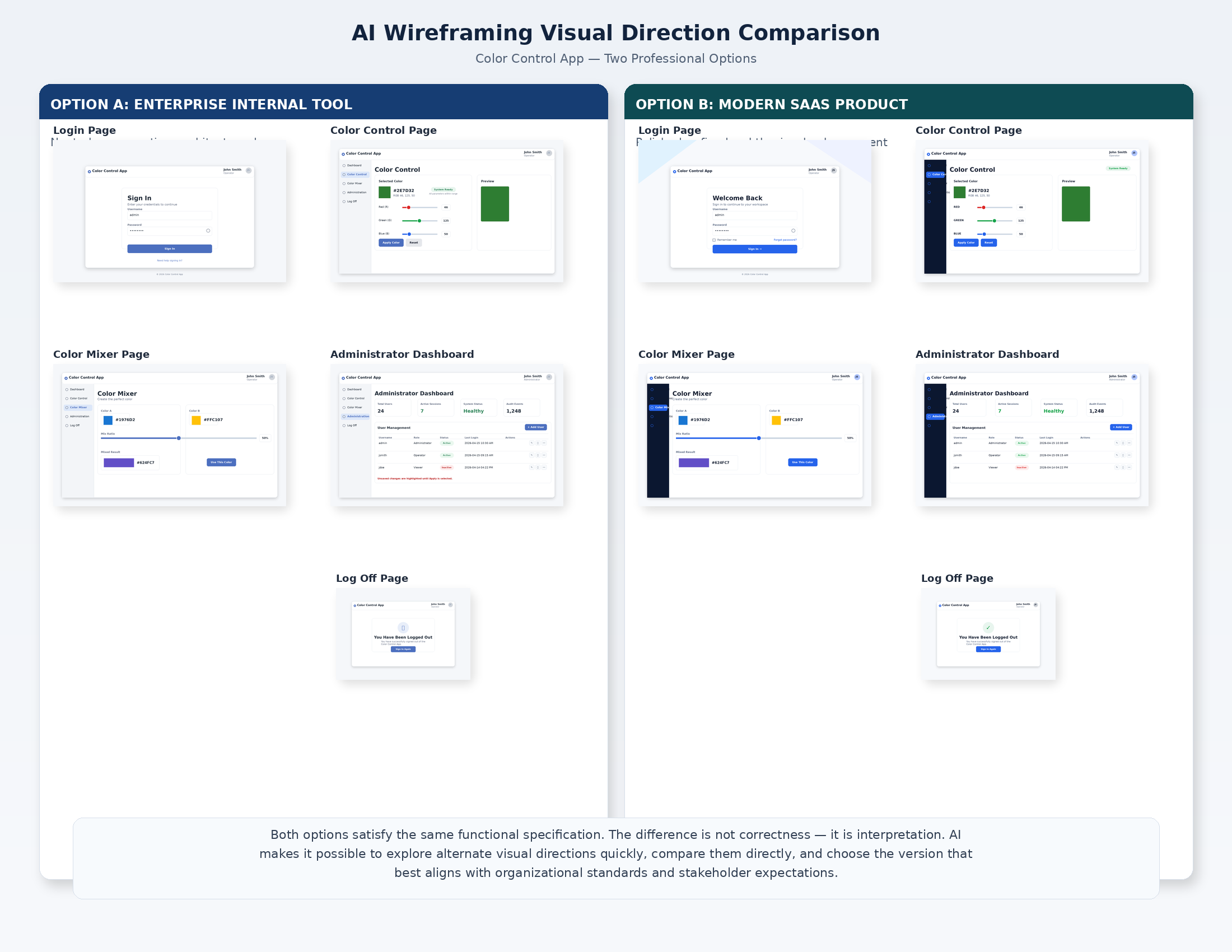
Two valid AI-generated visual interpretations of the same Color Control App specification: Option A (Enterprise Internal Tool) and Option B (Refined Modern SaaS Variant). Both satisfy identical functional requirements.
AI makes it possible to explore these interpretations quickly, compare them directly, and select the version that best aligns with user expectations and organizational standards — all before committing to a backend implementation. The specification does not change; only the visual direction does.
From Validated Wireframe to Vibe Coded Application
The wireframe specification — refined over multiple iterations until it accurately describes a working, tested application — becomes the primary input to the Vibe Coding process. The Color Control App specification provides:
-
A complete inventory of pages and the navigation relationships between them
-
The role-based access model and how it is enforced
-
The exact data each page needs to display and the operations it must support
-
Exact validation rules, verbatim error messages, and edge case handling for every interactive element
-
Acceptance criteria defining when each page is working correctly
-
Global constraints — footer content, navigation structure, button styling — that apply across the entire application
The backend specification is not a first draft — it is a tested design. The AI tools building the backend have clearer, more complete, and more internally consistent instructions to work from.
What This Approach Does Not Replace
It does not validate security. Role-based access in the wireframe is simulated in browser state. The full application needs a properly designed security architecture built separately.
It does not validate performance. Data that appears instantly in a wireframe may require optimized queries and infrastructure capacity in production.
It does not validate integration complexity. The wireframe says nothing about the complexity of connections to enterprise systems, APIs, or data sources.
It does not replace technical design. Data models, API design, infrastructure architecture, and technology stack decisions remain to be made.
The wireframe validates one thing: that the application idea — the UX, the workflows, the interactions, the information architecture — works the way you intended when a real person uses it.
Getting Started
Pick an application idea and describe its most important page in natural language. Load that description into an AI coding tool and ask it to build a 100%-in-browser prototype. What you get back will not be perfect — the gap between what you described and what the AI produced is your specification agenda for the next iteration. Add rules for each element that did not behave as intended. Generate again. Test again. Repeat.
The complete Color Control App specification in the appendix of this article is a working template for exactly this process. Start with one page. Refine it until it works. Then build from there.
Reuse
As you build new applications, either for yourself or for different areas of your business and IT stakeholders, look to leverage previous applications you've built. Make your documentation modular to help with making them reusable for future efforts, just like software developers and engineers make their code modular (and just like you expect AI to make its code modular). The reusable modularity will more easily allow you to copy/paste or load documentation from previous projects into new projects, making it faster and more affordable to get to results with every new project.
You can even start with content from the Appendix in this document to get yourself started on your own applications with AI.
Scaling: Scope Your Builds to Specific Use Cases
As many complex applications often do, you will most likely develop many pages for your own application(s). This will definitively increase both your build time and your AI resource consumption. When this happens, consider only building page sets that allow you to test explicit functionality and flows associated with more succinct use cases and page flows.
For example, your full application may have at total of 26 pages, A through Z, where page A is the Log On Page and page Z is the Log Off Page. Your prompt can be adjusted to tell AI to only build the pages and tests associated with specific use cases that only require specific pages. This might translate to something like…
-
Use Case #1: Only build and test pages A, B, F, M, T, Z
-
Use Case #2: Only build and test pages A, C, E, Z
-
Use Case #3: Only build and test pages A, B, H, I, J, W, X, Y, Z
Not only does this make it quicker to build for specific scenarios but it also helps ensure that you’ll better identify, understand and verify all your use case permutations and their associated user experiences (UX) for each.
Moving on to More Advanced Vibe Coding for Infrastructure
Wireframing is dramatically faster than having Vibe Coding build out your full application components and infrastructure — web servers, app servers, databases, object stores, integrations to other APIs and systems, virtual runtime infrastructure, and much more. In fact, you shouldn’t be worrying about any of these things until you know the functional foundations of your ideas work the way you expect them to. Furthermore, building out and vetting the wireframes to test all UI & UX look, feel, and functionality both simplifies implementation of all these other components and raises your probability of success for building the entire application along with its infrastructure, especially when you realize and understand that changing features often requires changes that impact backend components and infrastructure, which adds to build time, complexity, and probability of errors.
Decoupling and vetting the wireframes allows you to get your user-facing layer right and then acts to help constrain and guide the back end components and infrastructure build out. The best software developers and engineers know these issues and work hard to adhere to such best practices. I suggest you do so, too.
Closing Thought
Software development has always struggled with the same fundamental problem: the cost of discovering that an idea does not work is highest at the end of the build cycle. Design Thinking, OBD, GBD, TDD, and Agile have all offered the same prescription: find out earlier, when fixing it is still cheap. AI wireframing is the most accessible implementation of that prescription that has ever existed.
It puts the ability to build a working, interactive, testable representation of an application idea within reach of anyone who can describe what they want. It makes the idea visible, shareable, and testable before a single line of production code is written. The investment in getting the idea right before building the implementation is always recovered. Usually, it is recovered many times over.
Appendix A: Color Control App — Complete Wireframe Specification
The following is a representative specification used to generate the Color Control App wireframes referenced throughout this article. By representative I mean that you can write less and still get a basic application with limited features or write more and get a more complete solution. What you have below is somewhere in the middle and good enough to use as a learning baseline.
It is presented here so that it can serve as a working template for your own wireframe projects. The specification is organized in the four layers described in the article:
-
ground rules,
-
cross-page requirements,
-
page-by-page specifications, and
-
execution rules.
Copy and adapt this structure for any application you wish to wireframe — replace the Color Control App’s content with your own pages, behaviors, and acceptance criteria, keeping the structural approach intact.
Note: I have not made this application responsive for narrowing browsers or smaller mobile devices. You can do so, should you like.
STARTING PROMPT FOR AI… (Copy everything below this point into AI)
This document represents a set of constraints, requirements, specifications, and instructions for an application called “My Color Control App”. Follow the instructions below to generate the application to run 100% in the browser.
A.1 Overview and Purpose
"My Color Control App" is a simple multi-page web application that serves as the running example throughout this article. The application allows users and administrators to:
-
Log into the application using a user ID
-
Experiment with colors and apply a desired color as a border that appears consistently across all pages
-
Mix colors using both RGB (light) and RYB (paint/pigment) color models
-
Manage application users and their roles (administrators only)
The application runs entirely in the browser with no backend, no database, and no external infrastructure. The real intellectual property in a wireframe exercise is the idea itself — the user experience, the workflows, the behaviors, and the outcomes the application is designed to support. The backend and infrastructure come later, after the idea has been validated.
A.2 How This Specification Is Structured
This specification is organized in four layers, each building on the one before it:
-
Layer 1 — Ground Rules and General Constraints: Baseline rules that apply globally, covering technology constraints, interaction standards, and terminology.
-
Layer 2 — Cross-Page Requirements: Elements and behaviors present on every page (or every page with named exceptions), including the header, footer, navigation, and global interaction patterns.
-
Layer 3 — Page-by-Page Specifications: Detailed requirements, constraints, and acceptance criteria for each individual page.
-
Layer 4 — Execution Rules: The final instruction to the AI to build and run the application.
A.3 Layer 1: Ground Rules and General Constraints
The following rules apply globally. The AI tool generating the wireframe must respect these rules before processing any page-specific instructions.
A.3.1 General Rules
-
Document metadata: Ignore all document headers and footers. They are part of the document metadata and have no bearing on the instructions for building the application.
-
Session management: When instructed to "clear" or "clear all," wipe everything from the conversation and working session — all conversation history, generated code, and anything else maintained in session memory — in preparation for loading a new or updated specification.
-
Terminology — Screen vs. Canvas: "Screen" refers to the conversation or chat interface. "Canvas" refers to the area where the running application is displayed.
-
Terminology — Page: "Page" and "web page" are interchangeable throughout this specification.
-
Terminology — User ID: "User ID" and "username" are interchangeable throughout this specification.
-
Deployment constraint: Since this is a prototype for demonstration purposes only, the application must run 100% in the browser, with no dependencies on any external technology, server, database, or infrastructure.
A.3.2 Code Update Integrity Rules
The AI must treat the generated application code as a single coherent codebase. When revising or regenerating any part of the application, it must update or replace the prior implementation cleanly rather than appending overlapping or superseded code.
-
Single declaration rule: A component, function, constant, hook helper, or page renderer may be declared only once per file unless the language explicitly requires overloading. Duplicate declarations are forbidden.
-
Single ownership rule: Each named UI construct (for example, Footer, SideNav, TopBar, LoginPage, ColorControlPage, AdminPage, LogOffPage) must have exactly one authoritative implementation in the file.
-
Replacement rule: If the AI changes the implementation of an existing construct, it must replace the old implementation rather than leaving the prior version behind.
-
No orphaned code rule: The AI must not leave behind unreachable, superseded, stray, or partially deleted code blocks after a revision.
-
Balanced structure rule: All braces, parentheses, JSX tags, and control-flow blocks must remain balanced and syntactically valid after every update.
This directly prevents the two failures you saw:
-
duplicate Footer declarations
-
leftover orphaned return <AdminPage ... /> logic after the PAGE_ADMIN condition
A.4 Layer 2: Cross-Page Requirements
The following requirements apply to all pages unless an explicit exception is stated.
A.4.1 Page Footer
Every page must have a footer that displays the text "The International Foundation for Information Technology (IF4IT)" in maroon font, horizontally centered within the footer.
A.4.2 Page Title
Every page must display a page title in bold, larger font, with font color set to maroon. Exactly one page title must be shown at a time — never two simultaneously.
-
When the application header bar (Top Bar) is present: The Top Bar is the sole owner of the page title. Individual pages must not render their own titles in the page body.
-
When the Top Bar is not present (Login Page and Log Off Page): The page itself must render its title at the top of the page body.
Acceptance criteria:
-
On the Color Control Page and Administrator Dashboard Page: only the Top Bar shows the title; the page body shows no additional title.
-
On the Login Page and Log Off Page: the page body shows the title.
-
Navigating between pages must never result in two titles appearing simultaneously.
A.4.3 Navigation Drop-Down Selector
-
Every page except the Login Page must display a navigation drop-down selector at the top of the page, allowing the user to navigate only to pages the current user is authorized to access.
-
Control purpose: The "Navigate to:" control is for choosing a destination page, not for displaying the current page.
-
Default state: Do not preselect any page. Show a neutral placeholder (e.g., "Select a page...") until the user actively picks a destination.
-
Current page in list: Include the current page but mark it "(current)" and disable it so it cannot be selected as a destination.
-
Authorization filter: The list of destinations must be filtered by the current user’s role before rendering. Pages the user is not authorized to access must not appear at all in the list.
-
Administrator Dashboard visibility rule: The Administrator Dashboard Page must appear in this drop-down only when the currently logged-in user has the Administrator role. It must never appear for regular users.
-
Selection behavior: When the user selects a page, navigate immediately and then reset the drop-down to the neutral placeholder.
-
Edge case: If there is only one other navigable page available, you may hide the drop-down entirely.
A.4.4 Log Off Button
All pages except the Login Page and the Log Off Page must display a "Log Off" button in the upper-right corner of the page.
- Expected outcome: When selected, immediately route the user to the Log Off Page.
*A.4.4.1 Logged-In User Identity Display* Every page that renders the Top Bar must display the currently logged-in user’s User ID and assigned role immediately to the left of the Log Off button.
-
Placement: The logged-in user identity display must appear in the upper-right area of the Top Bar, directly to the left of the Log Off button, aligned on the same horizontal row.
-
Content: The display must show:
◦ the logged-in user’s User ID
◦ the logged-in user’s assigned role, rendered as either "Administrator" or "User" -
Visual hierarchy: The User ID must be rendered more prominently than the role. The role must appear directly below the User ID in smaller text.
-
Optional avatar treatment: A circular badge containing the user’s initials may appear adjacent to the User ID and role block, provided the full User ID and role text remain visible and readable.
-
Persistence: Once a user logs in, this identity display must remain visible on every page that includes the Top Bar until the user logs off.
-
Exclusions: The identity display must not appear on the Login Page or the Log Off Page, because those pages do not render the Top Bar.
-
Role accuracy: The displayed role must always match the user’s current assigned role in the application.
-
Title separation rule: The logged-in user identity display is informational context only. It must not be treated as a page title and must not create a second title in the Top Bar.
Acceptance criteria:
-
When Jane Doe is logged in, the Top Bar shows "Jane Doe" and "Administrator" immediately to the left of the Log Off button.
-
When John Smith is logged in, the Top Bar shows "John Smith" and "User" immediately to the left of the Log Off button.
-
The identity display appears on the Color Control Page, Color Mixer Page, and Administrator Dashboard Page when applicable.
-
The identity display does not appear on the Login Page or the Log Off Page.
-
The page title remains the only page title shown in the Top Bar.
A.4.5 Button Styling
All buttons on all pages must use the following styling:
-
Default state: Very light grey background with black text.
-
Hover state: Background changes to black; text color inverts to white.
-
Visual treatment: All buttons — including Apply, Log Off, Yes, No, Add New User, and Delete — must have a 3D visual effect with clear, distinct borders that are visibly highlighted when the user hovers over them.
A.4.6 Messages and Notifications
Text placement instructions for messages and notifications are non-negotiable. The AI must place user-facing messages exactly where specified — message position is a UX requirement, not a layout suggestion.
A.4.7 Left Side Navigation Pane
Every page except the Login Page and the Log Off Page must display a vertical left side navigation pane.
-
Content: The pane alphabetically lists buttons, each representing a link to one of the other pages in the application that the current user is authorized to access. The pane must not include a button for the page the user is currently on. Pages the current user is not authorized to access must not appear in the pane at all.
-
Administrator Dashboard visibility rule: The Administrator Dashboard Page button must be rendered only for users whose current role is Administrator. It must never be shown to regular users.
-
Header: The top of the pane must display the label "Site Navigation" in bold, above the list of page links.
-
Footer button: The bottom of the pane must always display a "Log Off" button that routes the user to the Log Off Page.
-
Expected outcome when a navigation button is selected: The user is immediately routed to the corresponding page.
-
Exceptions: The left side navigation pane must not appear on the Login Page or the Log Off Page.
A.4.8 Screen and Cursor Stability
All screens and forms must remain stable. Do not design interactions so that a screen or form is torn down and rebuilt when a small change occurs.
-
Text input fields must remain continuous and active while the user is typing. The text cursor must never jump, reset, or require a mouse click after each character.
-
When UI elements need to appear or disappear (e.g., messages, panels), show or hide the existing instance rather than replacing it with a new one.
-
Stability acceptance check: Type at least 10 characters in each text field without touching the mouse; open and close any panels or messages. The cursor must remain in place throughout. If the cursor jumps or focus is lost at any point, the design is incorrectly recreating the interface element instead of keeping it stable.
A.4.9 Global Frame Setting
The color frame applied via the Color Control Page is a global, application-wide setting. Once applied, it must persist across all page navigations for the duration of the prototype session. This is not a per-page setting — any page that renders the application container must display the same frame.
*A.4.10 Role-Based Navigation Rule* All navigation controls in the application must be derived from a single role-filtered list of authorized destinations for the currently logged-in user. No navigation control may independently hardcode or infer its own page list. If a page is unauthorized for the current user, it must be absent from all navigation controls and inaccessible by direct navigation.
Implementation integrity note: When modifying navigation or authorization behavior, the AI must update the single existing navigation implementation rather than creating a second copy of related navigation or layout components under a reused or conflicting identifier.
A.5 Layer 3: Page-by-Page Specifications
A.5.1 The Login Page
Purpose: The default page users see when the application loads. Allows users to identify themselves and enter the application.
User ID input field:
-
Display a text input field labeled "User ID" and a "Log In" button immediately to the right of the field.
-
Cursor behavior: When the page loads, automatically place the cursor in the User ID field. Do not auto-select any existing text. Do not move the cursor while the user is typing. If the user navigates away and returns, place the cursor in the field again upon return. The field must remain selected continuously while the user types — typing must never be interrupted.
-
Field length constraint: Accept strings of 2 to 100 characters. The user must never be permitted to submit fewer than 2 characters.
Initial state — valid users:
-
"Jane Doe" — initial role: Administrator
-
"John Smith" — initial role: User (not an administrator)
Login outcomes:
-
Outcome 1 — Invalid user ID: If the entered user ID does not match any user in the system, display the following message in red font: "Invalid user ID. Please enter a valid user ID and try again."
-
Outcome 2 — Valid user ID: If the entered user ID matches a user in the system, immediately route the user to the Color Control Page.
"All Allowable Users" display section:
-
For demonstration purposes, this prototype displays all valid user IDs and their assigned roles on the Login Page in a section titled "All allowable users."
-
Introductory line: Must read generically, e.g., "You can log in using any user ID shown below." Do not name any individual user in the introductory text.
-
Each user ID must appear exactly once on this page. If a name appears in the list, it must not appear again anywhere else on the Login Page.
-
If a user is deleted via the Administrator Dashboard, their user ID must be removed from this list immediately and must not reappear.
A.5.2 The Color Control Page
Purpose: The primary page users land on after logging in. Allows users to select a color and intensity to apply as a visual border across all pages of the application.
Page subtitle: When this page renders, display the following text directly under the page title: "Use this page to select a color and color intensity that will be used to define the border for your entire application."
Frame rules:
-
Frame visibility: The applied frame must render inside the application container (inset frame) so it remains visible at all zoom levels and across all pages. Do not rely on an outside outline that may blend into the viewport edge.
-
Preview parity: The applied frame must exactly match the preview rectangle’s color and intensity (same hex value and same percentage).
-
Perceptibility guardrail: If the chosen color/intensity combination is likely to be hard to see on a white background (e.g., Yellow below approximately 35–40% intensity), prompt the user with: "This frame may be hard to see at the current intensity. Increase intensity or Apply anyway." Provide two actionable choices: "Increase intensity" and "Apply anyway."
ROYGBIV color control layout:
-
The page body consists of a vertically listed set of rows, one per color in the ROYGBIV spectrum: Red, Orange, Yellow, Green, Blue, Indigo, Violet. Each row uses a strict three-column layout.
-
Alignment acceptance criteria: For every color row — the radio button and label are in the left column; the slider is in the middle column, horizontally aligned with the radio label; the color rectangle is in the right column on the same line as the slider; the "Intensity" percentage label is directly under the slider; nothing wraps to a second line at ≥ 1024px width or at 100% zoom.
-
Radio button labels: Each radio button is labeled with the color name and its hex code in parentheses — e.g., "Blue (#007aff)."
-
Radio button default state: No radio button is selected when the page loads.
-
Radio button mutual exclusivity: Selecting any one color radio button must reset all other radio buttons, sliders, and color rectangles to their default (unselected) states.
Slider behavior:
-
Each slider controls the brightness of its corresponding color relative to that color’s normal/base value. The slider must support both darker-than-base and lighter-than-base output. The midpoint of the slider is the color’s default/base value. Sliding left makes the color darker. Sliding right makes the color lighter.
-
Default selected position when a color row becomes active: When a user selects a color radio button, that color’s slider must initialize at the exact midpoint of the slider track, representing the color’s default/base value. The slider must not initialize at the far right.
-
Brightness scale definition:
-
Left end = darkest version of the selected color
-
Middle = default/base version of the selected color
-
Right end = lightest version of the selected color
-
The UI and implementation must treat the midpoint as the neutral starting state for the selected color.
-
-
Default state: All sliders are inactive when the page loads.
- A slider must not be interactive unless its corresponding radio button is selected.
-
A disabled slider must remain visually in place at the same size — it must not disappear or cause the layout to reflow.
-
All sliders must be left-aligned with each other. The leftmost position of any slider must clear the longest color label and hex code in the left column.
-
Under each slider, display a light grey label showing the current brightness position relative to the base color. The midpoint must be visually understood as the default/base setting. The wording may be "Brightness" or "Shade Level," but it must not imply that the far-right endpoint is the default starting value.
Color rectangle behavior:
-
Each row has a color display rectangle to the right of its slider.
-
Default fill: White when the slider is inactive.
-
Border color: Always the full-intensity hex color for that row, regardless of slider position, so the outline remains crisp.
-
Active rectangle (when radio button is selected): The fill color is wired to the slider and changes in real time to reflect the current intensity. The current hex color code at the selected intensity must be displayed in black text inside the active rectangle.
-
Midpoint color rule: When a color row is first selected, the color rectangle must display the selected color’s default/base hex value, corresponding to the midpoint slider position. Moving left darkens that displayed color. Moving right lightens that displayed color.
Reset radio button:
-
"Reset" is listed last, after all ROYGBIV rows. There is no slider for the Reset row.
-
Expected outcome when Reset is selected: All color display rectangles return to white. All sliders reset to their default inactive state.
Apply button:
-
Positioned below all radio button rows, aligned to the lower right of the content area.
-
Expected outcome when Apply is pressed with a color selected: The color frame is rendered inside the app container using the exact hex value and intensity shown in the active rectangle. The frame appears immediately on the current page and persists across navigation to all other pages.
-
Expected outcome when Apply is pressed with Reset selected: The frame is removed entirely from all pages. No residual outline or border remains.
-
Success confirmation: After Apply, display a small, non-blocking confirmation message: "Applied {ColorName} @ {Percent}% — visible on all pages."
Acceptance criteria:
-
If the user applies color value #00a000, both the active rectangle’s fill and the applied border must match #00a000 exactly.
-
If the user applies color value #ffff00, both the active rectangle’s fill and the applied border must match #ffff00 exactly.
-
When a user selects any ROYGBIV color, that color’s slider handle appears at the exact midpoint of the slider.
-
From that midpoint, moving the slider left makes the color darker than its base/default value.
-
From that midpoint, moving the slider right makes the color lighter than its base/default value.
-
The active rectangle shown at midpoint must equal the selected color’s base/default hex value.
-
The slider must never initialize at the far-right end when a color is selected.
A.5.3 The Color Mixer Page
Purpose: Allows users to experiment with color mixing using interactive controls. Supports two mixing models selectable by the user.
Mixing mode selector: Display a control that allows the user to switch between two modes at any time:
-
RGB (Light) mode: Use when mixing colored light (screens, LEDs). Implement as a true additive model: sum channel values weighted by ratio, clamp at 255. Do not divide by total weight. Assume full-intensity primaries: R=(255,0,0), G=(0,255,0), B=(0,0,255).
-
Subtractive (Paint / RYB) mode: Use when mixing paints, inks, or pigments. Simulate mixing physical pigments using a Red-Yellow-Blue (RYB) model with a color-wheel approach. Do not use simple numerical averaging, which produces dull, washed-out results.
-
Mode toggle persistence: When the user switches modes, retain the currently selected input colors so the user can directly compare how the same inputs produce different outputs in each mode.
RGB (Light) mode — canonical expected outcomes (per-channel tolerance: ±5):
-
Red + Green → Yellow (≈ #FFFF00)
-
Green + Blue → Cyan (≈ #00FFFF)
-
Blue + Red → Magenta (≈ #FF00FF)
-
Red + Green + Blue (equal intensities) → White (≈ #FFFFFF)
-
Any primary + its complement at equal intensities → White (Red+Cyan, Green+Magenta, Blue+Yellow)
-
Any color + Black (0,0,0) → Unchanged (black adds no light)
-
Same-color addition: Red + Red → brighter red, clamped at (255,0,0)
-
Order independence: Red + Green must equal Green + Red
Subtractive (Paint / RYB) mode — canonical expected outcomes:
-
Yellow + Blue → Green
-
Yellow + Red → Orange
-
Blue + Red → Purple
-
Equal parts of all three RYB primaries → Dark neutral ("mud")
Implementation note: RGB mode outcomes 4–7 above require additive superposition, not arithmetic averaging. Sum channel contributions with weights and clamp — do not divide by total weight.
- RGB saturation/clamping note: Because RGB (Light) mode uses additive summation with clamping at 255, different input combinations may sometimes produce the same visible output color. The implementation must still recompute and refresh the result fields when any input changes.
Result display:
-
Always display the resulting mixed color as a filled color swatch and as a label (color name or hex code).
-
If a third color is added, the result must still behave like physical paint or light mixing, not a numerical average that dulls the output.
-
The result must remain vivid when mixing vivid inputs. It must not wash out to grey unless the user is mixing near-opposite colors at near-equal ratios.
-
Visible recomputation feedback: Whenever any input color, ratio, or mixing mode changes, the Mixed Result section must visibly refresh by updating the result swatch and/or one or more supporting result fields such as the hex value, label, or a “last updated” indicator. This requirement applies even if the newly calculated output color is visually identical to the previous output.
Interactivity:
-
Color mixing must be real-time and interactive: as the user changes any input color or ratio, the result must update immediately without requiring a button press.
-
Include sliders for adjusting the mixing ratio of each input color.
-
Allow the user to click on each color swatch to change the input color for that slot.
-
Allow the user to add an optional third input color.
-
Include a brief set of usage directions on the page explaining how to click swatches to change colors and how to add a third color.
-
Result recomputation rule: The Mixed Result must be recalculated immediately whenever any input color, ratio, or mode changes. A recomputation is required even if the newly selected combination mathematically produces the same visible result color as the prior combination.
Layout constraint: All mixer controls, swatches, sliders, and result displays must be contained within the main content area. They must not overlap with the header, footer, or left side navigation pane.
Acceptance Criteria:
-
Changing any input color, ratio, or mode must immediately trigger a recomputation of the Mixed Result.
-
If the recomputed result color is visually identical to the prior result, the result label and/or hex value must still refresh so the user can tell the system responded to the change.
-
At least two acceptance-test scenarios must use input combinations guaranteed to produce visibly different result colors when one input changes.
A.5.4 The Administrator Dashboard Page
Purpose: Allows users with the Administrator role to view, add, remove, and change the role status of application users.
Access restriction:
-
Only Administrator-role users may access this page.
-
Non-administrators (i.e., a regular user that has not been given administrative rights MUST NEVER see the Administrator Dashboard page or any related links as an available destination in any navigation mechanism, including but not limited to anything in the body of the pages, the navigation drop-down selector, and the left side navigation pane. This should be such that when a non-Administrative user logs on, he or she is always brought directly to the main color control page with no views of administrative buttons or links anywhere on the page.
-
If a non-administrator reaches this page directly by any means (for example, a bookmarked state, direct route, typed path, deep link, or any other bypass of normal navigation), the application must immediately redirect that user to the Color Control Page.
-
This access restriction must be enforced both in the UI rendering logic and in the page-routing logic. Hiding the link alone is not sufficient.
Users Table:
-
Render the users list as a table (not a list) with a header row and exactly four columns, left to right: User ID (text only), Administrator (checkbox to toggle admin status), Role (read-only: "Administrator" when checked, "User" when unchecked), Actions (Delete button, right-aligned in column).
-
Do not combine the user name and the checkbox in the same cell — keep each in its own column.
-
The Role column is display-only. Role changes are made exclusively via the Administrator checkbox.
-
Rows must always be sorted alphabetically by User ID.
Add New User:
-
Below the Users Table and above the Apply button: a text input field for adding a new user, with an "Add New User" button immediately to its right.
-
Expected outcome when Add New User is selected: The new user is added to the allowable users list and appears immediately in the Users Table in alphabetical order. The new user’s Administrator checkbox defaults to unchecked (User role). The Login Page’s "All allowable users" list must update to include the new user.
Guardrail — Minimum one administrator:
-
The application must always have at least one user with the Administrator role. Enforce this rule when the administrator presses Apply, not as the checkboxes are being changed.
-
If applying changes would result in zero administrators, reject the changes and display the following message in red text, positioned just to the left of and at the same vertical level as the Apply button: "There MUST always be at least one administrator for this application."
Unsaved changes indicator:
- Whenever any value or state on this page is changed (toggling a checkbox, adding a user, or deleting a user), display the following message in red text, positioned just to the left of and at the same vertical level as the Apply button: "You made changes to this page. Please save your changes."
Apply button:
-
Must be positioned at the lowest right corner of the page, below all other content including the Add New User row.
-
Expected outcome — legal changes: Apply all pending changes. Display the message "Your changes have been applied." This message must disappear automatically after approximately 2–3 seconds.
-
Expected outcome — illegal changes (zero administrators): Reject changes without applying them. Display the minimum-administrator error message described above.
Build quality guardrail: The timed success message callback must contain exactly one clean action (clearing the message). Do not leave stray punctuation (extra semicolons or commas) inside or immediately before the timer callback. Acceptance check: The success message appears after Apply, disappears automatically after 2–3 seconds, and the application builds without syntax errors.
Acceptance criteria — Administrator visibility and access control:
-
When logged in as Jane Doe (Administrator), the user can see the Administrator Dashboard in the navigation drop-down and in the left side navigation pane.
-
When logged in as John Smith (User), the user cannot see the Administrator Dashboard in the navigation drop-down.
-
When logged in as John Smith (User), the user cannot see the Administrator Dashboard in the left side navigation pane.
-
If John Smith (User) attempts to reach the Administrator Dashboard directly, the application immediately redirects him to the Color Control Page.
-
At no time during a regular-user session may the Administrator Dashboard page title, page body, navigation option, or navigation button be visible.
A.5.5 The Log Off Page
Purpose: Shown whenever the user selects any Log Off button or link from any page. Asks the user to confirm before ending their session.
Page content: Display the text "Are you sure you wish to log off?" prominently on the page.
Below this text, display two separate buttons labeled "Yes" and "No":
-
Expected outcome when No is selected: The user is routed back to the last page they were on before selecting Log Off. The application must track the prior page so this routing is always correct regardless of which page the Log Off button was selected from.
-
Expected outcome when Yes is selected: The user is routed to the Login Page and the session is effectively ended.
A.6 Layer 4: Execution Rules
At this point, build and run this application, ensuring that it runs 100% in the browser with no external dependencies on any technology or infrastructure.
When the application is built and ready to test, confirm this explicitly. Do not present partial output or ask clarifying questions — implement the full specification as written and confirm when it is ready for interaction.
Before declaring the application ready to test, the AI must verify the following…
A.6.1 Codebase integrity requirements before declaring the build ready:
-
The application builds without syntax errors after every revision.
-
The AI must verify no duplicates - that no component or function identifier is declared more than once in the same file unless intentionally required by the language.
-
The AI must verify that no obsolete or stale implementation remains after a revision to an existing component or logic block.
-
The AI must verify that every conditional rendering block has exactly one valid control-flow path and no stray return statements or unmatched braces remain from prior edits.
-
Every revised feature is implemented by updating the existing authoritative code path, not by leaving both old and new versions in the file.
-
No unreachable or orphaned return statements remain in any conditional rendering function.
-
If an existing page, component, or control is changed, the resulting file contains only one active implementation of that item.
-
The AI must not declare the application ready until these integrity checks pass.
Published by Guerino Enterprises, LLC – Copyright Guerino Enterprises & Frank Guerino